Ev
Mon 30 June 2025
# Block 1: Import necessary libraries
import pandas as pd
import matplotlib.pyplot as plt
import seaborn as sns
import plotly.express as px
import numpy as np
# Block 2: Load the dataset
# Sample EV adoption dataset (can replace with real one)
data = {
    'Country': ['USA', 'China', 'Norway', 'Germany', 'UK', 'India', 'France', 'Canada', 'Netherlands', 'Japan'],
    'EV_Sales_2020': [330000, 1300000, 105000, 194000, 175000, 22000, 111000, 54000, 90000, 56000],
    'EV_Sales_2021': [607000, 3200000, 153000, 355000, 310000, 48000, 165000, 94000, 115000, 87000],
    'EV_Sales_2022': [918000, 6800000, 174000, 475000, 420000, 90000, 200000, 123000, 130000, 110000],
}
df = pd.DataFrame(data)
df
| Country | EV_Sales_2020 | EV_Sales_2021 | EV_Sales_2022 | |
|---|---|---|---|---|
| 0 | USA | 330000 | 607000 | 918000 |
| 1 | China | 1300000 | 3200000 | 6800000 |
| 2 | Norway | 105000 | 153000 | 174000 |
| 3 | Germany | 194000 | 355000 | 475000 |
| 4 | UK | 175000 | 310000 | 420000 |
| 5 | India | 22000 | 48000 | 90000 |
| 6 | France | 111000 | 165000 | 200000 |
| 7 | Canada | 54000 | 94000 | 123000 |
| 8 | Netherlands | 90000 | 115000 | 130000 |
| 9 | Japan | 56000 | 87000 | 110000 |
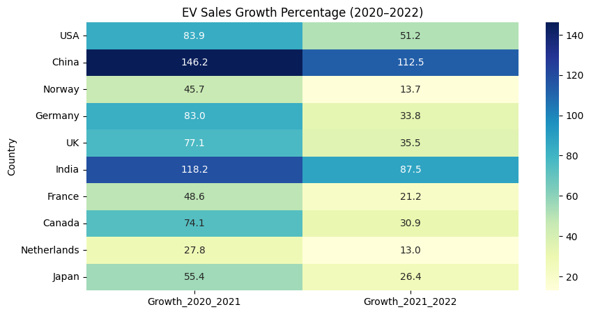
# Block 3: Calculate Growth Rate
df["Growth_2020_2021"] = ((df["EV_Sales_2021"] - df["EV_Sales_2020"]) / df["EV_Sales_2020"]) * 100
df["Growth_2021_2022"] = ((df["EV_Sales_2022"] - df["EV_Sales_2021"]) / df["EV_Sales_2021"]) * 100
df.round(2)
| Country | EV_Sales_2020 | EV_Sales_2021 | EV_Sales_2022 | Growth_2020_2021 | Growth_2021_2022 | |
|---|---|---|---|---|---|---|
| 0 | USA | 330000 | 607000 | 918000 | 83.94 | 51.24 |
| 1 | China | 1300000 | 3200000 | 6800000 | 146.15 | 112.50 |
| 2 | Norway | 105000 | 153000 | 174000 | 45.71 | 13.73 |
| 3 | Germany | 194000 | 355000 | 475000 | 82.99 | 33.80 |
| 4 | UK | 175000 | 310000 | 420000 | 77.14 | 35.48 |
| 5 | India | 22000 | 48000 | 90000 | 118.18 | 87.50 |
| 6 | France | 111000 | 165000 | 200000 | 48.65 | 21.21 |
| 7 | Canada | 54000 | 94000 | 123000 | 74.07 | 30.85 |
| 8 | Netherlands | 90000 | 115000 | 130000 | 27.78 | 13.04 |
| 9 | Japan | 56000 | 87000 | 110000 | 55.36 | 26.44 |
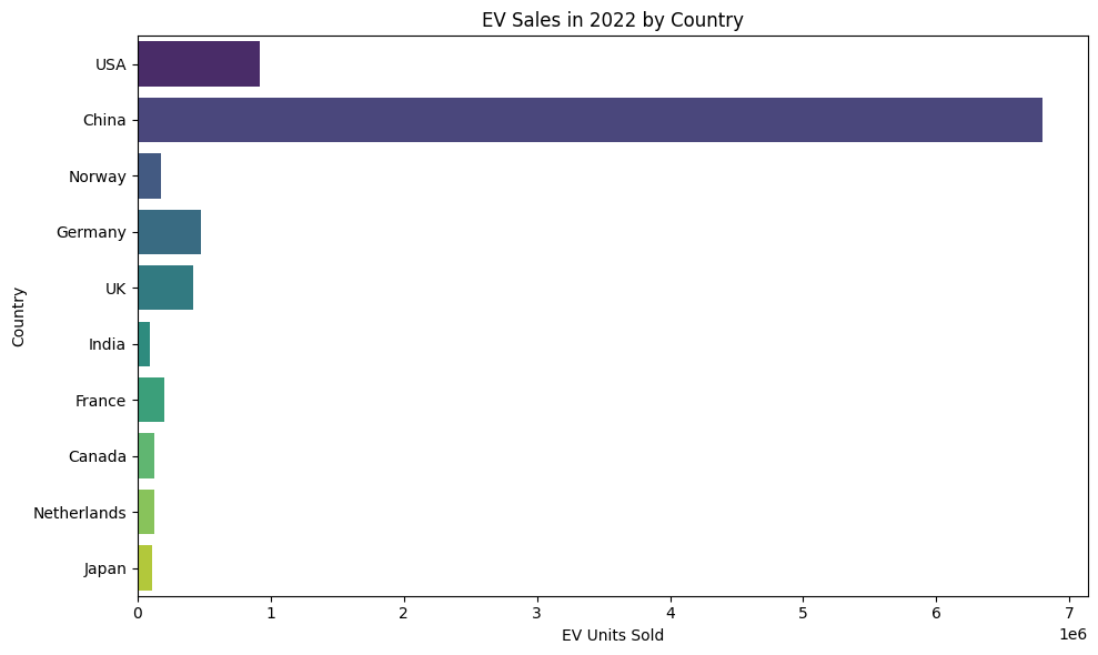
# Block 4: Bar chart - 2022 EV Sales by Country
plt.figure(figsize=(10,6))
sns.barplot(x="EV_Sales_2022", y="Country", data=df, palette="viridis")
plt.title("EV Sales in 2022 by Country")
plt.xlabel("EV Units Sold")
plt.ylabel("Country")
plt.tight_layout()
plt.show()
C:\Users\HP\AppData\Local\Temp\ipykernel_11660\3378219073.py:3: FutureWarning:

Passing `palette` without assigning `hue` is deprecated and will be removed in v0.14.0. Assign the `y` variable to `hue` and set `legend=False` for the same effect.

  sns.barplot(x="EV_Sales_2022", y="Country", data=df, palette="viridis")
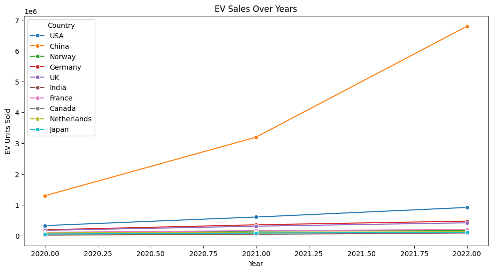
# Block 5: Line plot - Year-wise EV sales
df_long = pd.melt(df, id_vars=['Country'], value_vars=['EV_Sales_2020', 'EV_Sales_2021', 'EV_Sales_2022'],
                  var_name='Year', value_name='EV_Sales')
df_long['Year'] = df_long['Year'].str.extract(r'(\d+)')  # <-- fixed here
df_long['Year'] = df_long['Year'].astype(int)

plt.figure(figsize=(12,6))
sns.lineplot(data=df_long, x='Year', y='EV_Sales', hue='Country', marker='o')
plt.title("EV Sales Over Years")
plt.ylabel("EV Units Sold")
plt.show()
# Block 6: Heatmap for growth percentages
growth_data = df[["Country", "Growth_2020_2021", "Growth_2021_2022"]].set_index("Country")
plt.figure(figsize=(10,5))
sns.heatmap(growth_data, annot=True, cmap="YlGnBu", fmt=".1f")
plt.title("EV Sales Growth Percentage (2020–2022)")
plt.show()
# Block 7: Top 5 countries by 2022 EV sales
top5 = df.sort_values(by="EV_Sales_2022", ascending=False).head(5)
top5[['Country', 'EV_Sales_2022']]
| Country | EV_Sales_2022 | |
|---|---|---|
| 1 | China | 6800000 |
| 0 | USA | 918000 |
| 3 | Germany | 475000 |
| 4 | UK | 420000 |
| 6 | France | 200000 |
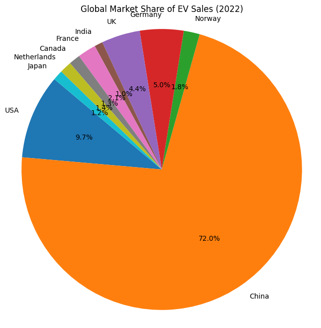
# Block 8: Pie chart of market share (2022)
plt.figure(figsize=(8,8))
plt.pie(df["EV_Sales_2022"], labels=df["Country"], autopct='%1.1f%%', startangle=140)
plt.title("Global Market Share of EV Sales (2022)")
plt.axis('equal')
plt.show()
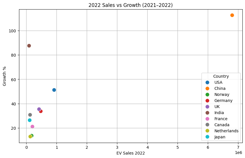
# Block 9: Scatter plot - 2022 vs Growth
plt.figure(figsize=(10,6))
sns.scatterplot(x="EV_Sales_2022", y="Growth_2021_2022", data=df, hue="Country", s=100)
plt.title("2022 Sales vs Growth (2021–2022)")
plt.xlabel("EV Sales 2022")
plt.ylabel("Growth %")
plt.grid(True)
plt.show()
# Block 10: Interactive Plotly bar chart
fig = px.bar(df, x='Country', y=['EV_Sales_2020', 'EV_Sales_2021', 'EV_Sales_2022'],
             title='EV Sales by Country (2020–2022)', barmode='group')
fig.show()
# Block 11: Add average sales column
df["Average_Sales"] = df[["EV_Sales_2020", "EV_Sales_2021", "EV_Sales_2022"]].mean(axis=1).astype(int)
df[["Country", "Average_Sales"]]
| Country | Average_Sales | |
|---|---|---|
| 0 | USA | 618333 |
| 1 | China | 3766666 |
| 2 | Norway | 144000 |
| 3 | Germany | 341333 |
| 4 | UK | 301666 |
| 5 | India | 53333 |
| 6 | France | 158666 |
| 7 | Canada | 90333 |
| 8 | Netherlands | 111666 |
| 9 | Japan | 84333 |
# Block 12: Highlight countries with below-average growth
threshold = df["Growth_2021_2022"].mean()
below_avg = df[df["Growth_2021_2022"] < threshold]
below_avg[["Country", "Growth_2021_2022"]]
| Country | Growth_2021_2022 | |
|---|---|---|
| 2 | Norway | 13.725490 |
| 3 | Germany | 33.802817 |
| 4 | UK | 35.483871 |
| 6 | France | 21.212121 |
| 7 | Canada | 30.851064 |
| 8 | Netherlands | 13.043478 |
| 9 | Japan | 26.436782 |
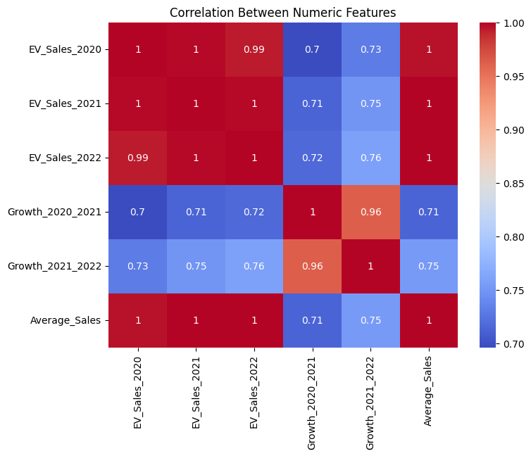
# Block 13: Correlation heatmap
plt.figure(figsize=(8,6))
sns.heatmap(df.corr(numeric_only=True), annot=True, cmap="coolwarm")
plt.title("Correlation Between Numeric Features")
plt.show()
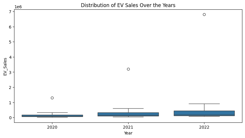
# Block 14: Boxplot of sales over years
plt.figure(figsize=(10,5))
sns.boxplot(data=df_long, x="Year", y="EV_Sales")
plt.title("Distribution of EV Sales Over the Years")
plt.show()
# Block 15: Save results to CSV
df.to_csv("ev_sales_analysis.csv", index=False)
print("Data saved to ev_sales_analysis.csv")
Data saved to ev_sales_analysis.csv
Score: 15
Category: basics